Although I am still not going to be sending regular newsletters from this feed, I have an even better offer for you.
As some of you may know, for the last several years, I have been the data editor for the S.F. Chronicle. It’s been an incredible experience. The journalists I get to work with are so talented and more skilled than me in many respects.
Now that we’ve figured a few things out, the data team is starting a newsletter called the “California Data Dive.” The first one came out this weekend. It’s a fun look at how the storms have impacted California’s reservoirs. It also includes links to other data-focused stories and some trivia.
Thanks for joining me for the 31st issue of the Golden Stats Warrior, a newsletter for data-based insights about the Bay Area. If this is your first time reading, welcome! You can sign up here. Thank you for your support!
I created this newsletter because I wanted to learn more about the Bay Area and, hopefully, help others do the same. It was a way to push myself to think locally, read locally, and act locally. Writing this newsletter has made my life so much richer. It also led me to a new job!
Starting March 15th, I will be the data editor at the San Francisco Chronicle. It’s a dream position. I get to work with the Chronicle’s awesome data and development team and bring even more data analysis and visualization to the newspaper. I will be working with data reporters and beat reporters across the newsroom to cover Covid-19, housing, crime, climate, and much more.
If you are not already a San Francisco Chronicle subscriber, I hope you will consider becoming one. Their coverage of vaccine distribution, the housing crisis, and police killings is already serving the region’s residents and holding governments to account. If you like data-oriented journalism, the Chronicle is making a real commitment to that kind of coverage by hiring me and several other great reporters. We will be hiring even more data reporters in the near future, so let me know if you know any great people.
I intend to keep writing this newsletter, but a bit less frequently over the next several months. In the meantime, if you have ideas of issues or data you think the Chronicle should be covering, please email me or send me a message on Twitter (my information is at the bottom of this newsletter).
Bay Area media recommendations of the week
A lot of fascinating policymaking has been going on in Berkeley lately, and the best place to read about it is in Berkeleyside. Here are a few examples:
Emilie Raguso reported the city’s recent policing reforms, including deprioritizing low-level traffic offenses like not wearing a seat belt. The city hopes this will reduce racial disparities in traffic stops.
The Berkeley City Council recently began a process intended to end exclusionary housing zoning in the city. Reporter Supriya Yelimeli explains that the city will attempt to ban zoning that only allows single-family houses in a neighborhood, which was developed to exclude Black families from certain parts of Berkeley. The Council also hopes that allowing for more multi-unit housing will lead to an increase in affordable housing. (Check out KQED’s great SOLD OUT podcast for more about zoning policy.)
(Seen any great Bay Area media recently? Send it to me!)
Dan’s favorite things
There is almost certainly no day trip from the Bay Area that will make residents feel more transported than visiting the Sacramento-San Joaquin River Delta. The first time I visited, on my way home from Sacramento to Oakland, I was shocked to find a landscape and architecture that better fit my imagination of Louisiana than California.
The incredibly flat agricultural region is covered in rivers, sloughs, and canals, many of which were shaped by the late 19th century workers who converted it from swamp to arable land. Many of those workers were Chinese immigrants who were not allowed to live in central parts of core delta towns. As a result, one community of Chinese immigrants formed the town of Locke in 1915. Though few Chinese people live there today, the town has been preserved for its historical significance. I visited recently and it’s a must-see. I suggest listening to this terrific podcast from Asian Americana to better understand the history of the town.
If you think a friend might enjoy this newsletter, please forward it along. You can follow me on Twitter at @dkopf or email me at dan.kopf@gmail.com. The Golden Stats Warrior logo was made by Jared Joiner, the best friend a newsletter writer could have. Follow him @jnjoiner. Also, thanks to my favorite skeptic Kanchan Gautam for copy editing this week.
Thanks for joining me for the 30th issue of the Golden Stats Warrior, a newsletter for data-based insights about the Bay Area. If this is your first time reading, welcome! You can sign up here. Thank you for your support!
Several weeks ago, I decided this newsletter would be about what we could learn about the Bay Area’s Covid-19 vaccination progress. It’s perhaps the most important issue facing the region (and the world), so an obvious subject choice. But in the course of my research, I’ve realized gaining any insight from this data is an incredibly fraught exercise. When it comes to data comparing how counties or states are doing on vaccine efficiency or equity, you should take it with more than a grain of salt.
Let me share a few examples.
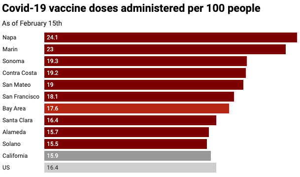
The first question I had about vaccinations in the Bay Area was how the region’s counties compare to one another in vaccination rates. The chart below shows the number of vaccines administered per person as of February 15th for each of the region’s nine counties according to data from the California Department of Public Health and San Francisco Chronicle. (Remember, this data includes both first and second doses. Currently, comparable data on the number of first and second doses administered by county is not available.)
A quick look at that chart would suggest that Napa County has been better able to vaccinate its citizens than other counties in the region. It might also make you think that whiter, lower poverty counties like Napa, Marin, and Sonoma are performing better than their peers.
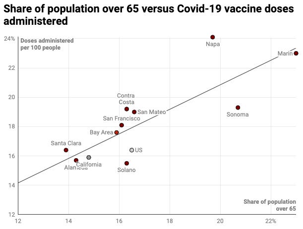
In reality, the main factor leading Napa and Marin to such high vaccination rates is the age of their citizens. The state distributes vaccines to counties based on the number of eligible residents, which at this point mostly includes people over 65 and healthcare workers. Below is a scatter plot showing the strong relationship between vaccination rates and the share of people over 65 in a county.
Why some counties, like Napa, are administering more vaccines than others with a similar share of seniors, like Sonoma, is hard to say. It may be because there are more healthcare workers (I haven’t found a good explanation—if a reader has thoughts, I would love to hear them).
To better judge the performances of counties, it would be ideal to see the share of vaccine doses released to a county that have been administered. Unfortunately, as far I can tell, it’s not possible to access that data.
Another big question about vaccines is whether they are being distributed equitably. Are people of certain races more likely to get the vaccine? How about people of higher incomes?
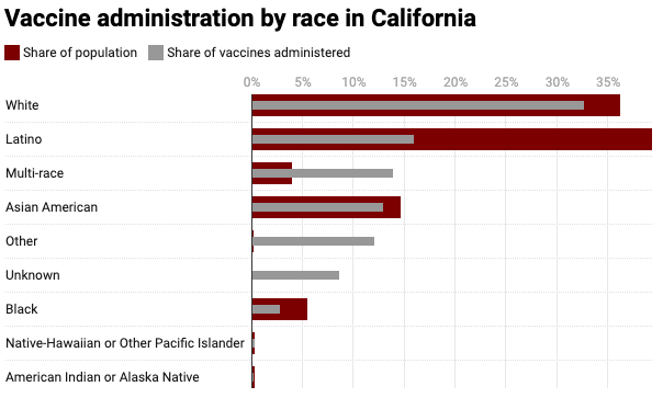
Again, unfortunately, it’s difficult to glean insights from data on race and vaccinations. Across the US, demographic data for vaccine recipients have not been carefully collected. It seems that healthcare workers and recipients are not filling out race and ethnicity forms accurately.
We can see this in California’s data. For about 9% of all vaccinations in California, there is no race data at all. Also, the share of people in the data listed as “other” (12.1%) and multi-race (13.9%) is higher than plausible given California’s overall demographics. Data for Bay Area counties have the same issue.
Given the messiness of this data, it seems to be inappropriate to use it for any sort of analysis. And even if the data was more accurate, when examining possible inequities, it’s important to consider how many people of each group are eligible for the vaccine. For example, the Latinx population in California is, on average, much younger than the state’s Black population, so fewer Latinx people will be eligible.
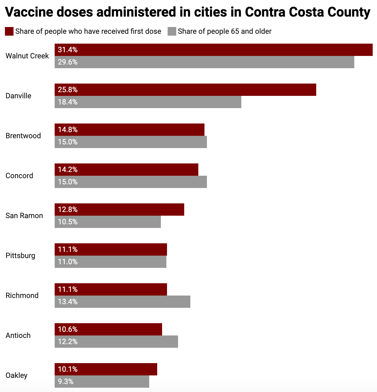
Still, there is some data available that point to inequities. A few Bay Area counties provide data on the number of people in particular cities that received the vaccine. For example, Contra Costa lists the number of first and second doses received for each of the 31 cities in the county. The data show that richer, whiter cities like Danville and San Ramon have had more first doses administered than people over 65, while poorer cities with more Black residents like Richmond and Antioch have had fewer. Some of these differences could be explained by the number of healthcare workers, but a large portion is likely the result of access issues.
Overall, my recommendation is when it comes to thinking about vaccine success, at this point, don’t take raw numbers at face value. Access and fairness when it comes to the vaccine is an incredibly important issue, but given the state of the data, we need to be careful about using it to come to any conclusions.
Just because we don’t have great data, that doesn’t mean we should just assume the vaccine distribution is being done fairly or efficiently. History suggests the rich will receive better healthcare, so it makes sense to monitor access to the vaccine. But in this case, we need to go beyond the headline numbers and pay attention to health researchers and on-the-ground reporting.
Bay Area media recommendations of the week
Two recommendations this week.
First, everyone should read the San Francisco Chronicle’s excellent reporting on the police killing in Danville in 2018. Investigative reporter Rachel Swan acquired videos and documents that suggest the death of Laudemer Arboleda could have easily been avoided. The police officer who killed Arboleda has faced no charges and his department’s internal affairs division found he did not violate any policies.
Second, my friend Tim Fernholz recently pointed me to science reporter Andrew Alden’s Oakland Geology blog. I am sure every post is interesting for the geology buff, but for me, the real fun was in Alden’s attempt to retrace the path of the first European expedition to Oakland in 1770. It’s fascinating to imagine Spanish army captain Pedro Fages and his soldiers walking along the borders of what is now Lake Merritt.
(Seen any great Bay Area media recently? Send it to me!)
Dan’s favorite things
The Bay Area is blessed with steps. Many neighborhoods in our hilly region have stairways to make going up easier for pedestrians. In the East Bay, where I live, those steps were mostly built in the early 20th Century to make it more efficient for people living in the hills to get to the streetcars which would take them to downtown Oakland and San Francisco for work.
Seeking out these steps makes for an excellent urban hike. For a great set of “trails”, I suggest picking up Charles Fleming’s Secret Stairs: East Bay. The book has 38 recommended walks. I’ve done three of them and they were all full of surprise and charm.
If you think a friend might enjoy this newsletter, please forward it along. You can follow me on Twitter at @dkopf or email me at dan.kopf@gmail.com. The Golden Stats Warrior logo was made by the great Jared Joiner, the best friend a newsletter writer could have. Follow him @jnjoiner. Also, thanks to my favorite crow enthusiast Kanchan Gautam for copy editing this week.
Share this post
Data show rich cities are failing the Bay Area on housing
Thanks for joining me for the 29th issue of the Golden Stats Warrior, a newsletter for data-based insights about the Bay Area. If this is your first time reading, welcome! You can sign up here. Thank you for your support!
I try not to express my political beliefs in this newsletter, but here is one I hold deeply: Rich communities should want to welcome more residents, particularly those less fortunate than them. Sadly, in the Bay Area, that doesn’t seem to be the case.
According to estimates from the US Census, the Bay Area’s population grew by about 10% from 2010 to 2019, reaching a total of 7.7 million people (I am using the nine-county definition of the Bay Area). Yet of the ten richest cities of the 101 cities in the Bay Area, not one of them grew faster than 5%. These cities are Atherton, Belvedere, Hillsborough, Los Altos, Los Altos Hills, Monte Sereno, Piedmont, Portola Valley, Ross, and Woodside. All of them had median household incomes of $220,000 or more in 2019.
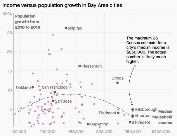
The chart below shows population growth in the 2010s versus household median income for each Bay Area city. The growth estimates are based on number of housing units built, as well as birth and death rates. (Here is a link to an interactive version of the chart.)
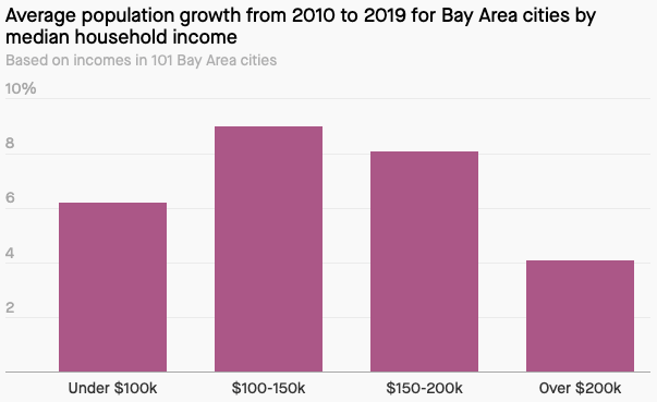
The data show that middle income cities have, on average, grown at a much faster pace than the region’s poorest and richest locales. You can see that relationship more clearly in the chart below which visualizes the average growth rates for cities by income level. The 42 cities with a median household income of $100,000 to $150,000 grew twice as fast as the 11 cities with incomes over $200,000.
It’s not surprising that poorer cities are growing slowly. People in the US have long left low-income cities to move to higher-income neighborhoods which typically have higher-rated schools, lower crime rates and better public amenities.
But why are rich cities in the region growing so slowly? It’s because, for the most part, they don’t want more people. Whether it’s to protect their property values, exclude Black people, keep down traffic or protect their city’s physical environment, these cities make it hard to build new housing. The Bay Area is an outlier when it comes to rich city population growth. In the 2010s, the average city in the US with a median household income of more than $200,000 grew at a rate 50% faster than than their counterparts in the Bay.
Take Cupertino, the home of Apple and a 1% population growth rate in the 2010s. The affluent 60,000 person city elected an anti-density mayor Steven Scharf in 2018, who once joked the Cupertino should build a wall around it to stop traffic coming in from San Jose. Residents filed a lawsuit to stop a 2,400 unit development at an abandoned mall that would include 1,201 affordable units. The suit was supported by the Chair of Cupertino’s Planning Commission. It failed. Scharf was not reelected in 2020.
“What we don’t want in our backyards—or yours, for that matter—is more gridlock, crowded schools, an overtaxed infrastructure and ecosystem,” explained Caryl Gorska, an officer for anti-density organization Better Cupertino, to Sasha Perigo for a terrific story in SF Curbed. “I really want to eradicate this idea that all growth is good, or even inevitable.”
The fact that cities like Cupertino fight growth has the effect of keeping them segregated. Of the ten richest cities in the Bay Area, none of them have a Black population of over 3%, even though about 6.4% of Bay Area residents are Black. The small number of Black residents in these communities is in large part the result of the long history of racially exclusionary laws intended to keep them that way.
For example, many of these rich cities have zoned an unusually large amount of their land for single-family homes. This was done with the intention of making these communities unaffordable for Black people who could only afford to live in a multi-unit building. (UC Berkeley’s Othering and Belonging Institute recently published a comprehensive history of the region’s housing segregation.)
So what do we expect to happen going forward? It’s not clear. Activists and policymakers are trying to make it harder for rich cities to keep out new residents, but these communities still have a lot of control over what gets built.
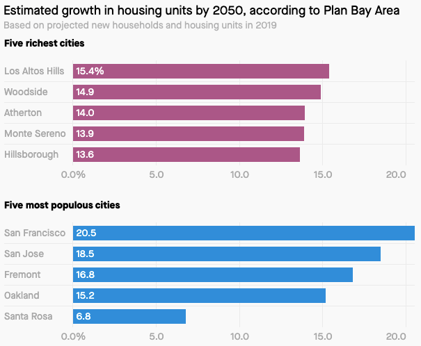
One reason rich cities could avoid building housing and desegregating is that they are generally not accessible by mass transit. Many efforts to increase housing, like Scott Wiener’s SB50 and Plan Bay Area, emphasize building near public transportation so that people don’t need to commute by car, and thus contribute to climate change. As a result, climate change now serves as an argument to keep some rich cities cloistered. The chart below shows that, if Plan Bay Area were to go into effect, housing unit growth would generally be higher in the Bay’s most populous cities than it would be in its richest. (These numbers are rough estimates based on units in 2019 and expected growth in units from 2020 to 2050.)
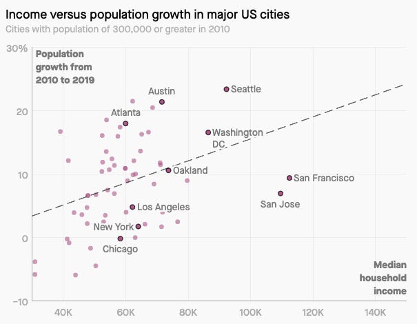
Finally, it is worth noting that though they have done better than their rich counterparts, San Francisco and San Jose have also done poorly in terms of growth for relatively wealthy cities. The Census data shows that Seattle and Washington DC have grown much faster than San Francisco and San Jose. So while the region’s rich cities need to do more, there is also room for growth in region’s urban centers.
Bay Area media recommendations of the week
The very best journalism holds the powerful to account. That is exactly what the San Jose Spotlight did with their excellent reporting on how some teachers and staff in the Los Gatos School District skipped the vaccine line.
Spotlight reporter Madelyn Reese uncovered that Los Gatos staff were offered vaccinations at Good Samaritan Hospital even though only healthcare workers and those over 75 were supposed to have access. Los Gatos is a wealthy suburb of San Jose. The staff were told they could skip the line out of thanks for a fundraiser they had held for the hospital in 2020. The teachers were told they had to pretend to be healthcare works when signing up for their appointment.
In response to the scandal, Santa Clara County will not provide Good Samaritan Hospital with more vaccines until they receive “sufficient assurances” they will follow the rules in the future. The Spotlight’s incredible work will certainly make other powerful actors less likely to circumvent the system in the future. And thank goodness for that.
(Seen any great Bay Area media recently? Send it to me!)
Dan’s favorite things
Hopefully, before the end of 2021 we will all get a chance to see live music again, and support local artists. I can’t wait. In preparation, I have been going through some of the “best of” Bay Area music lists of 2020, including articles from KQED, the SF Chronicle, and The Bay Bridged. I also loved this playlist from local music writer Nina Tabios.
My favorite discovery was the gorgeous jazz and experimental album “Familiar Future” by Dougie Stu. Below is a playlist with some of my other favorite recently released songs by Bay Area artists. Most of these are people living and working in the Bay, but I also took a few liberties (like including Hayward’s own Saweetie).
Thanks for your time, and see you in a couple of weeks.
If you think a friend might enjoy this newsletter, please forward it along. You can follow me on Twitter at @dkopf or email me at dan.kopf@gmail.com. The Golden Stats Warrior logo was made by the great Jared Joiner, the best friend a newsletter writer could have. Follow him @jnjoiner. Also, thanks to my favorite connector Chris Murphy for copy editing this week.
Share this post
The Bay Area's history is in shipping. What about its future?
Thanks for joining me for the 28th issue of the Golden Stats Warrior, a newsletter for data-based insights about the Bay Area. If this is your first time reading, welcome! You can sign up here.
I want to acknowledge how challenging these last few weeks have been. If you are in need of a little hope, I suggest you watch the Oakland Symphony’s Virtual Inauguration Ball, which includes performances by arts groups across the Bay Area. The performances, particularly by the kids, help me believe the future is bright.
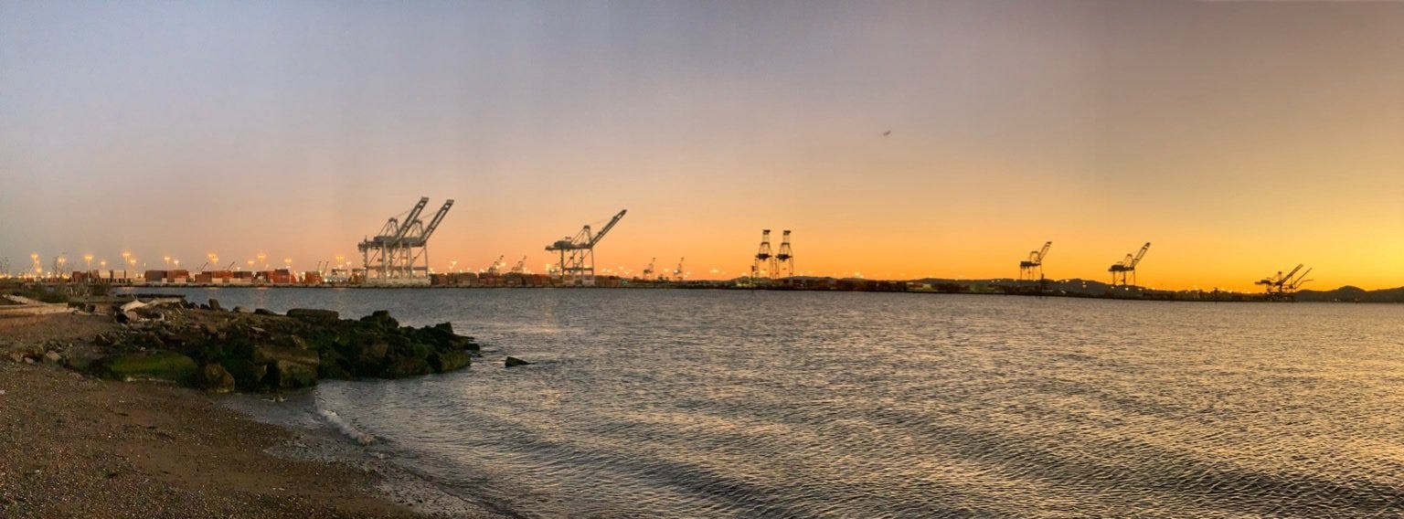
Welcome the giant cranes! In late December, three of the world’s tallest cranes entered the San Francisco Bay on their way to the Port of Oakland. At full stretch, the cranes reach more than 400 feet. Their long reach will allow the Port to handle cargo from ultra-large container ships. Bigger ships can carry more stuff, making the Port more efficient.
These cranes are part of the Bay Area’s long-running battle to maintain its status as a major shipping center. In the hyper-competitive shipping industry, ports need to constantly improve in order not to lose out to competitors. In the Port of Oakland’s case, this means convincing ships to dock in the Bay, rather than the ports of Long Beach, Los Angeles or Seattle.
The Port is a too often overlooked facet of Bay Area life. It is a source of good middle-class jobs and a boon to local manufacturers. It is also one of the region’s least accountable government agencies. This week’s newsletter is dedicated to the past, present, and future of the Bay Area’s first great industry. A story in five charts and a map.
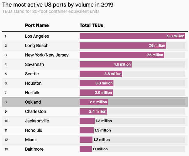
The Port of Oakland is the eighth biggest in the US
If you head to the Port of Oakland, located on the western most portion of city of Oakland, you are bound to see heaps of huge containers stacked on top of one another. These containers are an under appreciated key to globalization. The move from simply stuffing goods inside ships to putting them in stacked containers revolutionized shipping and made global trade more efficient.
Oakland was actually at the center of the container revolution. It was the first port on the West Coast of the US to build terminals for container ships, in part to serve the Vietnam War effort. (Check out the excellent Containers podcast to learn more about this history.)
In 2019, Oakland’s port was the eight busiest in the US. The equivalent of 2.5 million 20x8x8 feet containers came in and out of the port. There has been a small dip in volumes in 2020 due to the pandemic, but the Port is expected to rebound in 2021.
How come the Port’s not in San Francisco?
The original reason for San Francisco’s very existence as a major city was its port. The area near today’s Embarcadero was an excellent natural harbor, and the perfect place for trade after the Gold Rush in 1849.
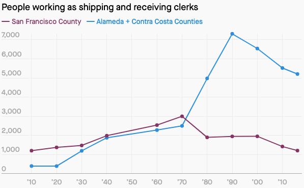
Over the 20th century, San Francisco lost its status as the Bay Area’s major port to Oakland for two main reasons. One, manufacturing left the city. As the city got richer, real estate for production plants near the port got more expensive. This meant trucks transporting good from ships to manufacturers were often stuck in San Francisco traffic. Two, when container shipping arrived on the scene in 1960s, large investments in money and land were needed for ports to accommodate containers. It made sense to make those investments in still spacious Oakland, but not in dense San Francisco, which was already moving to a services based economy.
The chart below shows this change through the number of people in San Francisco working as “shipping and receiving” clerks, versus those doing that job in the East Bay, according to US Census data. The major use of San Francisco port’s today is for cruise ships.
How Oakland lost to LA
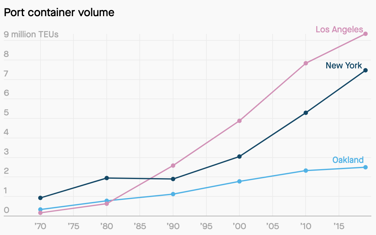
In the late 1960s, the Port of Oakland was the second busiest container port in the world. Today, it’s not even in the top 100. Although the Port of Oakland did get busier over the last 50 years, it grew much more slowly than competitors like Los Angeles and Long Beach. The chart below shows Oakland’s growth compared to LA and New York using data from the American Association of Port Authorities.
Essentially, Oakland has lost the size wars to Southern California’s maritime ports. L.A. and Long Beach together handle seven times more cargo volume than Oakland. These ports have benefitted from economies of scale and better rail connections to Midwestern and Eastern markets. L.A. and Long Beach have an intrinsic advantage in having 20 million customers within 100 miles, while the Port of Oakland has less than half the customer base. The nation’s railroads have invested heavily in access to L.A. and Long Beach, with negligible new investments for Oakland or the Pacific Northwest.
What actually comes in and out of the port?
Using data from the US Census, we can see exactly what is imported and exported from the Port of Oakland. The charts below show that a huge variety of goods are imported through the port, but the largest categories by customs value are electronics (like phones and computers), consumer goods (like furniture and toys), and cars. Most of these imports come from China and other countries in East Asia. The customs value of these imports was $31 billion in 2019. The categories in the chart below are the official categories used by the US government, so forgive me if they are a little confusing.
In contrast, the biggest exports are vegetables, meat and other food items. The majority of these products are headed to Asia, much of it grown in the California’s Central Valley. These exports were worth about $20 billion.
The Port is more than what you might think
What do the Oakland Airport, Jack London Square and Oakland’s ferry terminal have in common? They are all on land owned by the Port of Oakland. The Port of Oakland is not just a place where ships dock. It is an independent part of the Oakland city government governed by seven commissioners appointed by Oakland’s elected officials.
The Port controls about 20 miles of the waterfront, and acts as a landlord to the hotels, restaurants, airlines and shipping companies that use Port land. For example, the huge cranes were actually bought by the company SSA (Stevedoring Services of America), a tenant that helps load and unload ships.
The Port had revenues of almost $400 million in 2019, and the Port and its tenants employ around 30,000 people. Many of those jobs are the kind that the Bay Area doesn’t create much of anymore—middle-wage, skilled-labor positions that don’t require high levels of formal education.
Original image from Port of Oakland, then edited by SPUR
Not everybody is happy about the Port’s relationship to the City. Critics believe that the Port’s independence leads to a lack of oversight. Pollution from the Port has had disastrous impacts on the health of West Oakland residents. People living in the historically Black neighborhood have higher rates of cancer and respiratory conditions due to traffic coming in and out of the Port.
It’s also questionable that unelected officials choose what to do with some of Oakland’s most valuable land. Those decisions may be based on what is best for the Port’s growth, but not what’s best for the city overall. The fast-tracked approval of a WalMart on Port land is an example of these oversight issues, according to a report from Reimagine Radio.
What’s the future of the Port?
In order to stay competitive, the Port is making a few major moves.
Perhaps the most important of these projects is a new “Seaport Logistics Center” located on the old Oakland Army Base. The $52 million Center will allow for logistics and distribution to be done within the port, cutting out truck trips to send containers to outside distribution centers. It will also be directly connected to a train depot. The Center should make it easier for the Port to handle perishable goods, like food and medicine, that need to be kept in cold storage.
The Port is also investing in infrastructure and software to reduce traffic for trucks picking up goods from the ships, while also keeping down pollution from those trucks. These investments include improving WiFi and building an app for drivers to more easily navigate the Port.
And, of course, there are those huge cranes.
Finally, there is one notable development on the Port which doesn’t involve shipping. The Oakland Athletics and the Port are now in exclusive negotiations over building a 35,000 person baseball stadium on Port land. Housing, offices and retail would be built around the stadium. The prospective stadium is controversial. People in the maritime industry worry it would create more traffic around the Port and limit future expansion. Others believe Oakland already has a perfectly good stadium.
Bay Area media recommendations of the week
Over the last several decades violent crime dropped dramatically in the Bay Area, as it has in the rest of the US. The reasons for the decline are not well understood, but it is a trend we can all be happy about. Unfortunately, this year saw a 35% rise in killings in the Bay Area, reports Megan Cassidy in the San Francisco Chronicle. (The rest of the US saw a similar rise.)
There were a total of 285 homicides in the Bay Area’s 15 largest cities in 2020, up from 210 in 2019, with the largest increases occurred in Oakland and Vallejo. Cassidy’s reporting suggests that Covid-19 was a primary contributor to the rise. The pandemic increased the stress and anxiety that can lead to violence. The pandemic also made violence-reduction programs like Ceasefire, which works to reduce gang-related homicides, harder to implement due to social distancing measures. Police behavior following the murder of George Floyd may have also caused homicides to spike. Research finds that officer-involved shootings often lead to an increase in community violence, as police are less likely to do their jobs in response to protests.
(Seen any great Bay Area media recently? Send it to me!)
Dan’s favorite things
Most people reading this newsletter will have crossed the Bay Bridge countless times by car. But have you walked it?
Starting in 2013, it has been possible to walk or bike across the eastern section of the bridge from Oakland to Yerba Buena Island. It’s a little noisy due to the nearby cars, but the 2.2 mile path is a glorious way to re-experience the Bridge. A trip back and forth across the bridge, and then a little relaxation at the recently opened pier at the foot of the bridge in Oakland makes for a perfect socially distanced afternoon. There is a steady incline from Oakland to Yerba Buena, but it is doable for most bikers.
One last thought. The western half of the bridge is named after former San Francisco mayor Willie Brown. The eastern half is not yet named. Why not use this opportunity to honor an East Bay great like Ida Louise Jackson?
Thanks for your time, and see you in a couple of weeks.
If you think a friend might enjoy this newsletter, please forward it along. You can follow me on Twitter at @dkopf or email me at dan.kopf@gmail.com. The Golden Stats Warrior logo was made by the great Jared Joiner, the best friend a newsletter writer could have. Follow him @jnjoiner. Also, thanks to my favorite plant lady Kanchan Gautam for copy editing this week.