
The earliest data (and a chart) about the Bay Area
Time traveling
Thanks for joining me for the 13th issue of the Golden Stats Warrior, a newsletter for data-based insights about the Bay Area. If this is your first time reading, welcome! If you haven’t signed up yet, you can do that here. I am so grateful for your support.
First off, I want to wish everyone good physical and mental health. These are challenging times, and I hope you are all getting the support you need. I am sure I will write about the Bay Area and coronavirus in the future, but for this week, a little distraction. Let’s go back in time.
In the mid 1840s, there were fewer than 1,000 people living in the city of San Francisco—mostly Europeans who had displaced the native population through forced labor and disease. By 1860, as a result of the Gold Rush, the city of San Francisco had nearly 60,000 people.
The government of the maturing city determined it was about time the city put together municipal reports on the city’s budgets and operations. These reports, available digitally, might just be the oldest detailed data source about San Francisco—or at least that’s what a kind librarian at San Francisco Public Library told me.
The report for the 1859-1860 fiscal year offers all sort of fascinating data windows into that time. For example, below is the county clerk’s crime report. It’s difficult to see, but the first column is indictments, followed by convictions, not guilty, mistrials, discharged and forfeiting bail. Perhaps the most surprising indictments were for “fighting a duel,” “malicious mischief,” “poisoning cattle,” and “false pretences.”

From the coroner, they published a list of the method for the 31 suicides that year.

From the superintendent, they recorded information on what the 6,201 public school students studied. I find it notable how central music was to San Francisco’s early education system.

They also listed where those students were from, which demonstrates the staggering diversity of early San Francisco. (Van Dieman’s Land is what most Americans called the island of Tasmania.)

There is also a recording of the detailed financials of the previous seven fiscal years. Notice the massive investments in streets, roads and plazas in 1854 and 1855. This was the sign of a city that believed in itself.

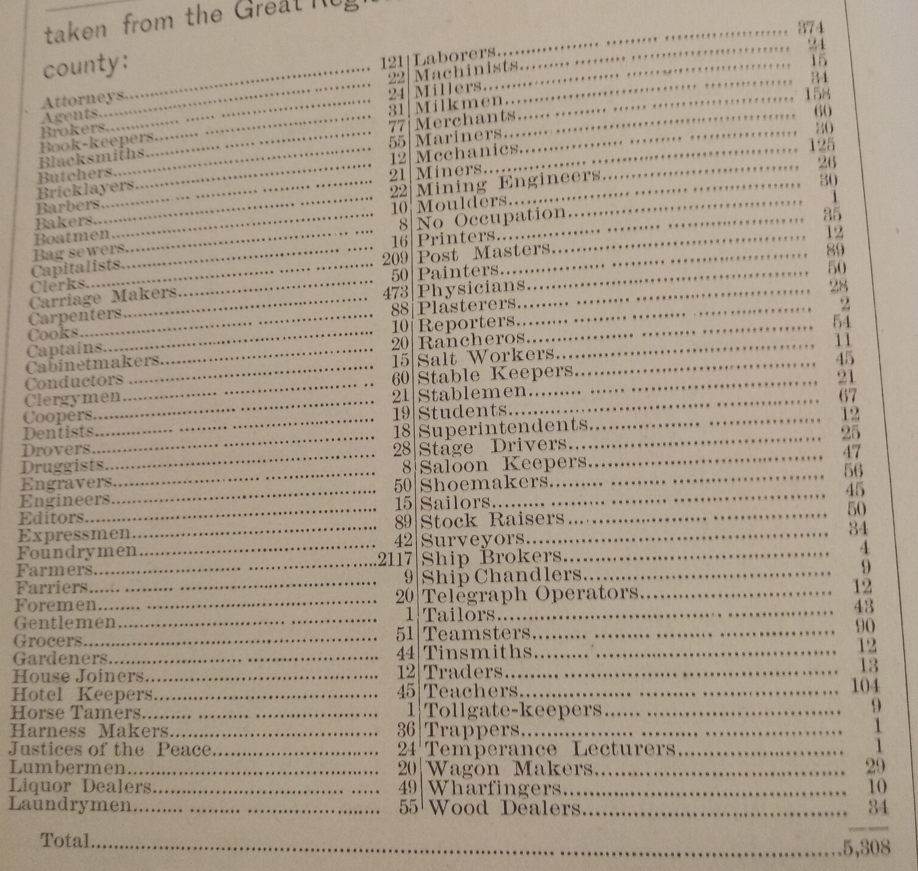
The earliest printed data that I could find from Oakland comes from the 1870 Oakland and Alameda County directory that was available at the Oakland History Center (it was not digitized). In this directory, which listed all of the city and county’s residents they also put together a table of the most common occupations done by residents. You can see that out of the 5,308 workers, the most common were farmers (2,117), carpenters (473), laborers (374) and clerks (209). I also enjoyed that there were 16 “capitalists” and one “temperance lecturer.” Please excuse my poor photo.
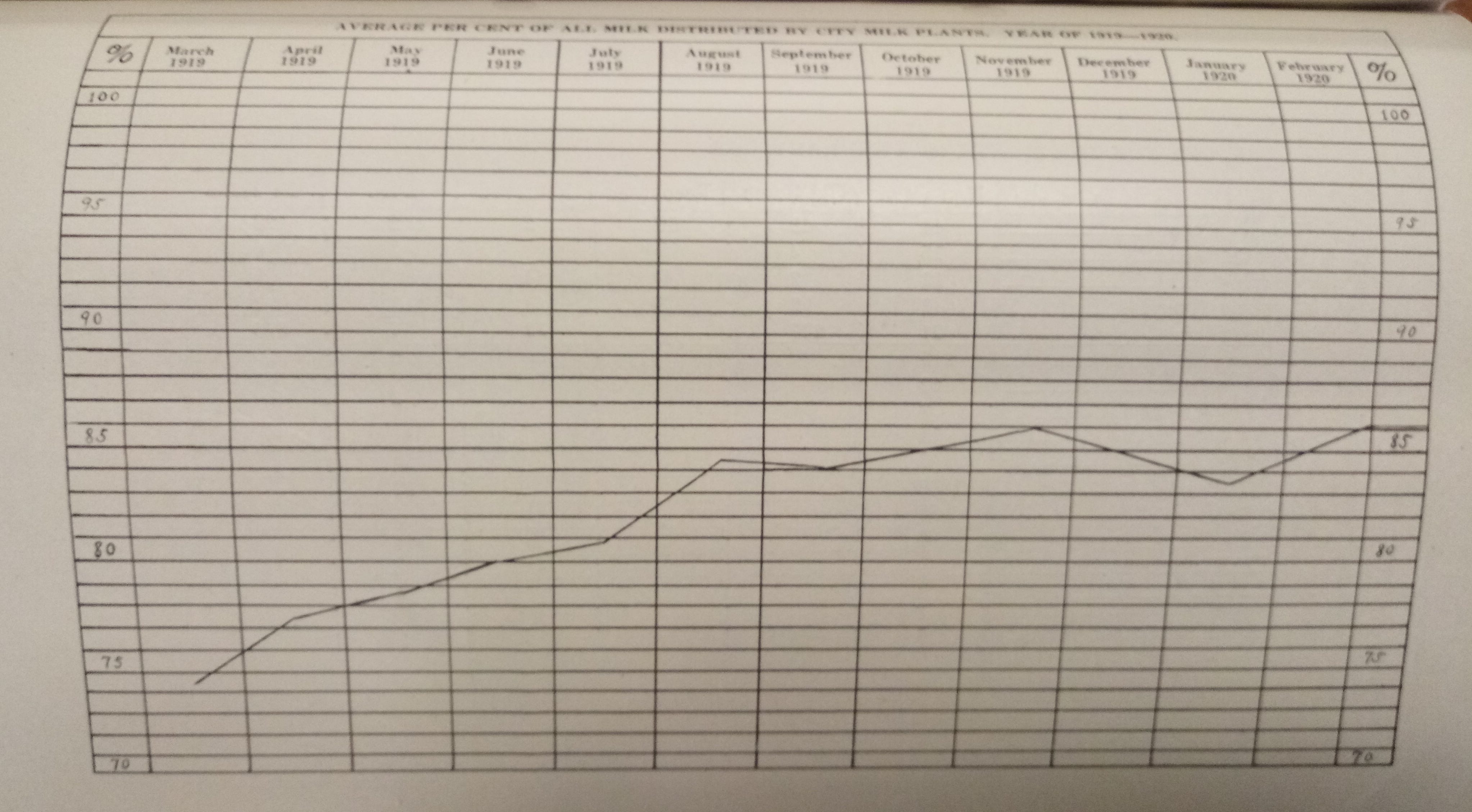
Finally, for all the chart geeks out there, the earliest chart about the Bay Area I found was from Oakland’s 1920 Health Bulletin (not digitized). It is a line chart that represents how much of the city’s milk comes from milk plants within the city.
Making a chart in those days was no easy feat, as it all had to be done by hand, and it was exceedingly rare. The Health Bulletins the years before and after included no charts. My hat goes off to the intrepid chart maker, who left no signature on their work. A true Golden Stats Warrior before their time!
Bay Area media recommendation of the week
It’s difficult to measure the effects of gentrification. While several studies have found that the negative financial and displacement impacts of gentrification may be overrated, it is without a doubt emotionally and culturally destabilizing for many people. This can be particularly true for disadvantaged minorities when large white populations move into a neighborhood, and complain about local culture.
For a recent article for Buzzfeed, the terrific data journalist Lam Thuy Vo put together the most detailed maps on racial gentrification I have ever seen. There are maps for five different cities, including Oakland. The maps go down to neighborhoods of about 5,000 people and show the changing proportions in each neighborhood. For example, from 2000 to 2017, I learned that my neighborhood in downtown Oakland became 17% less black over that period, with the share of Hispanic residents increasing by 6% and Asians by 4% and whites by 0.4%.

(If you read or listened to something great about the Bay Area this week, please send it to me!)
Dan’s favorite things
There is not much you can do in the Bay Area in these shelter-in-place days except go for a walk. And boy do I have the walk for you.
Last Summer, San Francisco opened the 17-mile Crosstown Trail that begins at Candlestick Point and ends at the Presidio. I did the walk several weeks ago, and it was wonderful (caveat: I only made it 13 miles).
I hesitate to tell you too much. I suggest starting the hike early one morning without looking at exactly where you will go. The surprises are part of the fun. There is a great smartphone app that will make sure you don’t get lost. After you finish, read this New York Times story on the hike by Nellie Bowles, one of the Bay Area’s greatest scribes.
Thanks for your time, and see you in a couple weeks.
If you think a friend might enjoy this newsletter, please forward it along. You can follow me on Twitter at @dkopf or email me at dan.kopf@gmail.com
The Golden Stats Warrior logo was made by the great Jared Joiner, the best friend a nervous newsletter writer could have. Follow him @jnjoiner. Also, thanks to the ingenious Nina Brooks for copyediting this week.